April 2, 2018

Comparing Fire Behavior Models in SEKI

Most of the modeling class we did not produce maps that I could showcase on this blog.  However this particular assignment required us to make 2 maps from the resulting fire behavior models that we had worked on.


The first map is a GIS overlay model and the second map is derived from the calculations we had using the BEHAVE software provided by the US Forest Service Fire and Aviation.  This is a tiny little program that uses data that you input for variables such as Fuel Model, Moisture, Wind Speed, and Slope called BEHAVE Plus.

For the design of the map itself, I tried to use colors on top of the DEM and took it possibly a little too far. I wanted my maps to look really detailed and interesting, because my classmates maps looked really poor if you just lay the DEM on top and don't do much else to it in Arc.  I did some experimentation in the "Image Analysis" screen including some pansharpening and other blending tweaks.  This went beyond what the assignment was requesting, but I'm glad I took the time to do this.  The "image analysis" window has almost what seems endless options to manipulate images, I really couldn't believe how powerful it was.

In the end though I probably should have kept the DEM black and white rather than use colors, because the resulting legend does not match the colors on the map. Lesson learned!

May 5, 2017

South Poles Converging Time Zones

This was the final map of the year, we were given the freedom to do whatever we wanted to showcase our creativity, imagination, and skills.  We were given certain guidelines and parameters that had to be met, but those were just basic things.


I chose to use this map to explore all the concepts that we learned about maps the entire semester including coordinate systems and different ways a map can show distortion which are area, distance, shape, and direction.  The map shown here utilizes 2 different coordinate systems, one for the time zones and one for the inset map / main map.  The reason for this is because I wanted to show how time zones all converge on to one single point.  As we look at most wall maps, which utilize the Mercator projection, one would think that time zones are all separated by hundreds of miles up and down the globe.  The regular observer does not take time to think that the Earth is sphere so that is not possible.  I color coded each time zone in the key, and it led to the flag mast at the south pole.  I also labeled research stations per county.  Lastly I actually had contours very lightly in the background to give the map some depth and a better look / feel.

May 4, 2017

Grand Teton revisited

As part of our final project, we were to take a map from earlier in the semester and redo it using the skills we learned throughout the semester.


There are so many differences and improvements here between this map and the original map I made.  First I labeled the contours and used masks to make them show up.  Next the colors are much more vibrant and do a good job of not hiding the most important part of the map which is of course the trails and rivers.  I maintained the same color scheme throughout the map, even in the shadows and north arrow, legend, etc.  Nothing on this map falls off of the border, which looked unprofessional the first time around.  And I used the DRG properly in this map, which is lightly seen in the background.

April 30, 2017

Where did the 2017 NFL first round draft picks go to school?

This weeks assignment was to tell a story with a map.  Seeing how the NFL draft just happened, I chose to use that event to as my "story".


I worked really hard on this one, and had several different things going on here.  First I chose to go with a choropleth map, which color coded each state ranked by number of draftees per state, which varied from 0 - 4.  I also labeled that number in the middle of the state.  I then found the college helmets of each school that had a player drafted, and labeled the players name next to the helmet.  The best way to do this to make it look good was to make a white circle around the helmet. This is due to the limitations with ArcGIS.  Lastly I listed the players on a table on the map.

March 21, 2017

Cattle in Rhode Island

This weeks assignment was working with choropleth maps otherwise known as thematic maps. We also worked with different classification methods.


We were instructed to take a state of our choosing and make a choropleth map of the number of cattle in that state by county.  We had to make 5 different maps and use different classification methods for each map.  We also had to make each map a different size.  This map right here is my favorite of the 5.  I chose the state of Rhode Island because its the smallest state, and allowed me to focus in on what I was doing better.  I really like how I made the counties stick out over the color choices.  I chose to place my ranch right in the middle of the state because the cattle seemed to be mostly located at the northern end and southern end.

Lastly, look at that scale bar, I couldn't believe how tiny Rhode Island actually is!

March 5, 2017

Legends

This week we moved away from maps a bit and concentrated on strictly legends.


The assignment was to take the data set from week 1 (which was a natural park / wilderness with ranches, rivers, roads, trails, and lakes) and make 5 completely different legends based on those feature sets.  The symbols, colors, shapes, fonts, and patch (among other things) all had to be different. I had a lot of fun with this assignment and think I did a good job.

February 20, 2017

Cattle in the U.S.

This week we studied dot maps, and studied different ways to use these types of maps.


The basic idea was to see how well we could design the map and show the viewer where all the cattle are located, using dot map techniques.  The size of the dot was not how I chose to go, instead I chose a dot density map.  I really like the colors I chose for this map, and I used shadows on the inset maps, rounded corners, and made it look really professional.

February 10, 2017

Injuries in the U.S. from extreme weather

This weeks assignment we had to take 3 different data-sets of our choosing that we were to find online, and make a map on how they correlate. We were mostly studying coordinate systems and the idea was to see how different coordinate systems affected the maps themselves.


I chose to go with extreme weather patterns in the US.  The above map shows the amount of injuries sustained from the weather events differentiated by color. My favorite coordinate system to show these particular datasets was USA Contiguous Lambert Conformal Conic.

February 6, 2017

Pacific Northwest Volcanos

This weeks assignment was to create a map of the volcanoes throughout the northwest US.  We were given a dataset consisting of roads, volcanoes, counties, rivers, and cities.


The idea was to take the volcanoes and make them appear larger or smaller, depending on the known eruptions it has had.  Also each county is color coded by population.  Lastly an inset map is shown due to the fact that it isn't exactly clear where exactly we are zoomed in on, as the northwest could possibly include part of California in some peoples minds.

January 22, 2017

Grand Teton National Park, first map for Cartography

First order of business was to make a map from the skills that we already have. We were given a data set consisting of file geodatabase from the Grand Teton National Park.  This is what I came up with.


June 30, 2016

Pansharpening

This week we learned the concept of band ratios, vegetation assessment using NDVI, more false color composites, and examining more imagery from cloud cover.


These maps right here look very unimpressive, but I actually did a lot with them.  For the pansharpened false color image, I mixed the 1 meter nominal spatial resolution of LANDSAT imagery and sharpened it to 30 meters nominal spatial resolution.  The second image is normal color non-pansharpened.


June 9, 2016

Color composites

This week we worked with multi spectral imagery captured by different sensors, knowledge of the electromagnetic spectrum, and normal vs false color composite imagery.


This here is a simple looking map, but what I did was create two different composites.  The top one is normal color whereas the bottom one is false color.

June 1, 2016

Georeferencing

This week we learned how to work with images, namely reduce noise with smoothing techniques and using gamma, contrast, brightness.  We also learned about light energy and albedos.


This map here isn't very impressive, but it isn't meant to be.  The assignment here was to georeference the above map without a coordinate system. We did this by selecting control points. I used NAD 1983 UTM North 15.  The control points I chose were at the top tip that looks like it is meeting a triangle, and the highway at the bottom.  Areas that are very distinct that I can see close up.

May 22, 2016

Welcome to remote sensing, working with rasters

This is week 1 of remote sensing, really excited about this class.  We began interpreting imagery in GIS, working with different file formats, introduced to pyramids and raster resolution, and making length determinations with imagery.

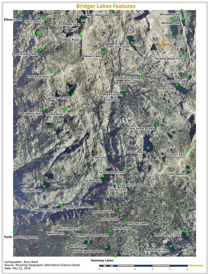
Sweeny Lake

This is a map I made of which incorporated a raster. We calcuated distances using the measure tool and closely observed the imagery.

May 10, 2016

Final Project

For the final project we were given free reign to really come up whatever we want as long as it was able to utilize the skills that we learned in this class.  There were a few other parameters too such as very basic things like having a legend, north arrow, utilizing some queries by location and attribute, and a minimum number of point, line, and polygon data sets. I exceeded the minimum requirements  by a long shot, I'm not even sure how anyone would do a project of this magnitude with the minimum requirements.  This is what I came up with:

So the idea here was rather simple, to design a neighborhood bike map for my daughter to explore our new neighborhood.  I discovered upon moving here that the residential streets around here (which is basically any street except highway 98) are laid out in a very disorderly fashion, almost like a labyrinth.  I don't necessarily think that is a bad thing, but I did think it needed a little help guide.  Enter my map!

I used roughly 15 data sets from 6 different sources throughout the internet to come up with all the data you see (such as Florida Department of Transportation, Florida Fish and Wildlife Conservation Commission, US Census Bureau, etc).  It's really amazing how hard it is to find a data set on the internet.  You would think that this kind of information would be what the internet is good for. But much of the data that I found was either lacking information, would not match the particular data that I needed, or worse yet, making you pay for it!  I found myself having to use bits and pieces of data from different sources and finding 1 field to match up with the other data set to join the tables together.

Anyhow I came up with a short path and a long path for the routes. I wasn't sure how to symbolize the route itself, so I did a little research.  Turns out this is how subways and bus's many times will mark the routes for their maps, and I found that worked out great for me too.  I made the labels on the streets that were on the route stand out more than the streets that were not utilized for the route.

I also used a slight overlay on top of base elements of the map to make them appear a little less "in your face".  One of the requirements for the project was to include a chart, so that is why that exists in the top left corner.  It kind of reminded me of a highway system, at the smallest scale possible.

I spent a while on the state map in the lower left, finally ending up happy with how I chose to symbolize Gulf Breeze. I wanted it to stick out more versus the other 2 cities that I had there just for reference.  I also used the color orange in Florida because of oranges. And then I took that color and used it as my base color for the graphical elements in the map. I chose complimentary colors of this orange as is seen in the font's and scale, among other items.

The city map has hwy 98 run through the middle, along with a few other random roads just for aesthetic purposes.  I was able to get the three bridges in the shot and label both Pensacola and Pensacola Beach as well as the Gulf of Mexico. I thought this gave the viewer a great idea of where Gulf Breeze is actually located.

Lastly for the parcels (buildings) I used a key at the bottom to identify the type from the main map.  I used the colors as are seen because I thought they contrasted well together.  As I wrote before I am colorblind, so these types of shades of colors are the types that I can distinguish easily.

April 16, 2016

Predicting landslides in San Bernardino

This week we took the same map used last week, but we had a different focus for what we were trying to accomplish with the presentation.

This was actually rather straight forward in that the most important aspect of this map is to show the viewer where potential landslides are in conjunction with the type of land that exists in a given area.  For instance water, industrial, residential, commercial, and so on.  So for this map more than some others I have done, it was especially vital that the colors at least had a feel for the feature it was representing. Water being blue is the most obvious. But forestry having a green or brown and maybe even industrial having a gritty ugly color might make some sense too.

Lastly it was absolutely vital that the landslides stuck out like a sour thumb. So when I need to do that, I typically will revert to a bright yellow. Luckily most of the landslides occurred over the "chaparral" areas, so the light green/tanish color was perfect to allow the landslides to be quite evident.

April 4, 2016

Faults, Landslides, and Geologic Structures

Building on last weeks into to elevation, we continued this week with a map of geologic features (soil, rocks, etc) and mapped that against the DEM.  This is in relation to the landslides and faults that are mapped out too.
Map of Landslides by Geographic Structures, San Bernardino County

So this week I used a hillshade on the DEM at 50% transparency again.  However the difference this week is that I used the top layer and the hillshade again on the bottom.  I think the colors I chose are both very Earthy and also very view-able for a colorblind person. When I say "view-able", I of course mean they are "distinguishable  from each other".

I think I learned from my mistake with the legend last time and made the legend quite a bit better.  Forget the horizontal format, I am speaking more of the format.  Geologic Features is obviously one entity, faults is another entity, and landslides is another. Therefore they all need to look the same.  The actual geologic features themselves are just a subset.  As such I kept them the same font but made the font smaller and changed to small caps.  This is the perfect kind of use for the "small caps" function.  I really dislike how the label of faults does not just extend to the end instead of just cutting off.  You don't really have too much control over how these legends are made using the tool.

We were instructed to make a regional map this week.  I messed around with some variations of it, but in the end I thought that given the space available, giving it a background with a shadow was the best choice.  One can make out that small study area, that's the whole point.

Last thing I did was realize that my faults were blending in with the rest of the map. So I changed them from the reddish color that they were originally to a blue.  Typically blue means water, but since water is not conveyed anywhere on this map in any capacity, using it for something you need to stick out is fine I think.

I also messed around with the layers of the faults, landslides, and 50% transparency top geologic feature layer. I decided to have the geologic feature layer by the very top layer, followed by the last 2 feature classes.  Reason being is that they were just too rigid, dark, and course on the very top.  It distracted from the beauty of the map as it is now.

March 28, 2016

My first map using a DEM

This week the theme was to make a map of the places where a helicopter can land in order to install a "bear box".  Obviously this is the first map in which we utilize DEM's, to display elevation.

Helicopter land spots, seki
Helicopter Landing Spots, SEKI 

So looking at my finished results, the first thing I love about it is the colors. It's hard to come up with a color pallet that both looks good and is viewable due to my colorblindness. But each of those 5 colors fit the bill.

I am new to mapping terrains and I have to say they are really interesting.  What you see here is actually a hillshade of the DEM with 50% transparency.

Placing the bear boxes was easy, pretty stragiht forward.  We did so by selecting 11 pre-determined locations from the entire campgrounds feature set.

Like last map, what I find myself doing is colorizing the map with however method fits the theme of the map. Then using the eye dropper tool to just randomly select 3 distinctly different colors and saving them in the color pallet.  Then I use those 3 colors for all of the jazz around the map (fonts, north arrow, scale bar, title).  I think this really makes the map feel more professional.

Every week I seem to struggle with how to approach the key, this week was no different.  I only had 1 feature class for the key, and a bunch of elevation values to display.  ArcMap doesn't allow you to have the name on the top and the label (picture) below it. They force you to fit a certain kind of mold for their legend maker.  Looking at it now, not very satisfied with the format. It appears as if elevation is a subset of Bear Boxes, whcih it is not, it's entirely it's own thing.  Elevation should have stayed small, but I should of given that whole group a name, such as Hills.

The title is too squooshed together, not enough white space.  That's the thing that sticks out to me the most. We were told to add a table to the map this week too, so I placed mine in the corner as such.

Can't wait for more DEM's!

March 21, 2016

John Muir Trail never looked sweeter

Behold, my 2nd map. This assignment we were told to make a map of the John Muir Trail which is located inside the Sequoia National Park.


The most important feature of this map obviously is the John Muir Trail itself. I experimented with various thicknesses of the trail, masks, and tried several different spacing to compose the trail itself.  One thing that I did in the end was design the other trails on the map with the same special design as the John Muir Trail.  Obviously they were thinner and a less prominent color to not stand out as much. But making them adhere to the same spatial design I felt was important so the viewer knew it was the same type of road (trail).

I didn’t particularly like the way the paved roads turned out, but that is just the way they are drawn up in the database.  I’m curious why they look so twisty and twirly and not more like actual roads.

I tried to adhere to a color scheme, even incorporating it into my scale, north arrow, and fonts.   I like the placement of my north arrow, and I tried various scales but ultimately I thought placing it dead center of the map was the best bet.

I thought my legend came out nice, even made the trails and roads an S shape for something different. We were told to include the total length of the John Muir Trail somewhere in the legend. I thought the best place for this was simply right next to it. Not really happy with that though because it looks so random as if it’s just floating out there for no reason. I considered putting an asterisk * next to the JMT and placing the length at the bottom, but decided against it.

March 9, 2016

My first map - Rae Lakes Camping Map

Well we finally got our first assignment this week to produce our first map. Up until this point we have mostly been studying theory and solving problems.  The assignment was to take this park map and produce a loop for the campers.  We were instructed to include a regional map and a state map to show the reader exactly where this is at.
my first map
Rae Lakes Adventure Camping Map


This is what I came up with. First order of business was to produce the main map. I really struggled with coming up with a color set that set each of the types of vegetation apart. I also experimented with the Rae Lakes Loop quite a bit in my attempt to make it stand out. No matter what colors I went with though it just seemed to blend too much in the background. 

One thing that bothered me that I just couldn't figure out how to avoid the Rae Lakes Loop washing out in the legend due to the white color. It's a small detail I should be able to figure out down the road.

I also tried various placements of the camping spots labels to avoid overlap and wound up going with bottom placement. 

We also had to make a regional map and a local map, both of which I was very happy with. I particularly love the placement that I came up with. I purposely made the square pointing to SEKI on the regional map the same color as the local SEKI map. I really love the design that I ended up with.
+